
In the design community, there is no constant debate on the best UX/UI design. There is zero question between Figma and Adobe XD. Figma is just the one to go and can be seen in all designer’s workflow. Even for a not-related project like rebranding for Rhode Island School of Design, Andrea Trabucco-Campos, Creative Director at NY-based Gretel, used it.
Simply, Figma is real-time collaborative and effictive.
For this reason, whether you are a product designer or not, intergrating Figma into your workflow is considered to be highly beneficial.
In this post, we will learn to use Figma. This is not a comprehensive guide, because I don’t like learning by reading long manual. I find I learn better by making mistakes, so here is some good pointers to start with.
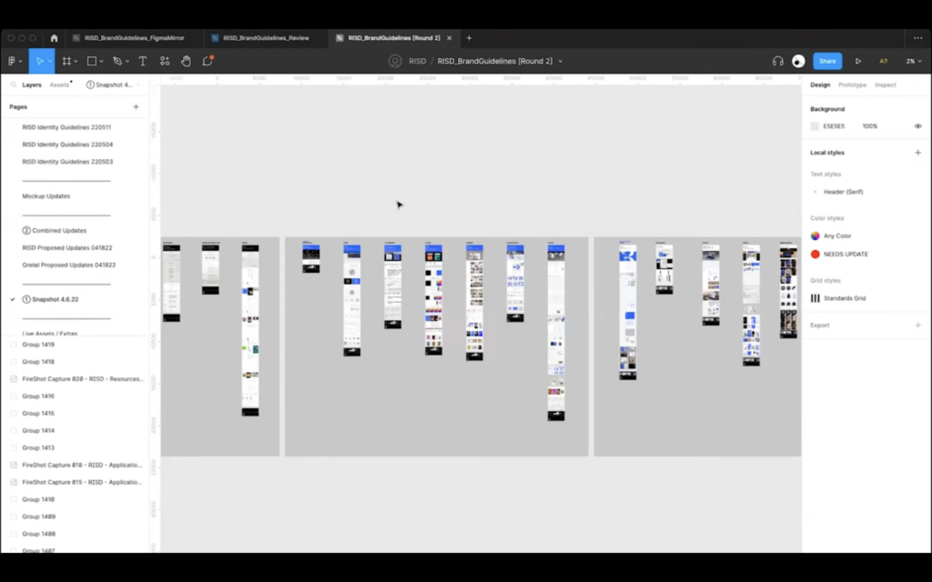
figma
anh’s notes from reading Beginners Guide To Figma With Tips And Tricks (Part 1 & Part 2) by Ajay Singh:
Figma is a collaborative interface design tool used for graphic design and user interface design.
Strength
- Free to use.
- Cross-platform compatibility (works on smartphone, Mac, and PC).
- Real-time team collaboration.
- Integrated developers hand-off specs for Mac and PC.
- High-quality prototyping with a fantastic team library.
Weakness
- Limited offline functionality compared to some competitors.
- Steeper learning curve for users accustomed to other design tools.
step-by-step guide
Step 1: Getting Started
- Sign up at Figma and follow the instructions.
- Create a new file to begin designing.
Step 2: Creating New Frames
- Press A or F to access frame options.
- Choose frame size or draw custom frames.
- Resize frames without quality compromise.
Step 3: Grids and Layouts
- Utilize trendy 12-column bootstrap grid or custom CSS Grid.
- Adjust grid properties for columns, rows, fixed or fluid layout.
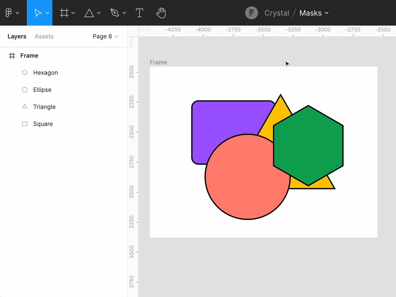
Step 4: Vector Shapes
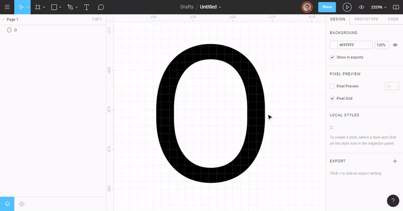
- Use Vector Networks to create and customize complex shapes.
- Create shapes quickly using shortcuts or pen tool.
- Scalable and exportable at any scale.
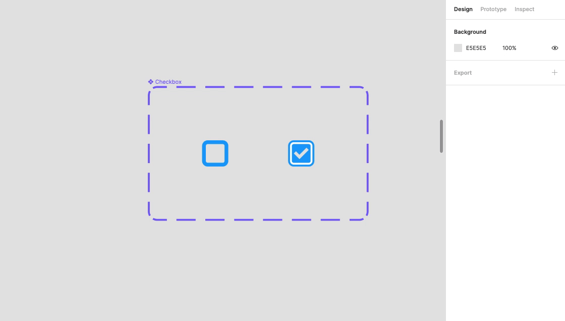
Step 5: Groups and Layers
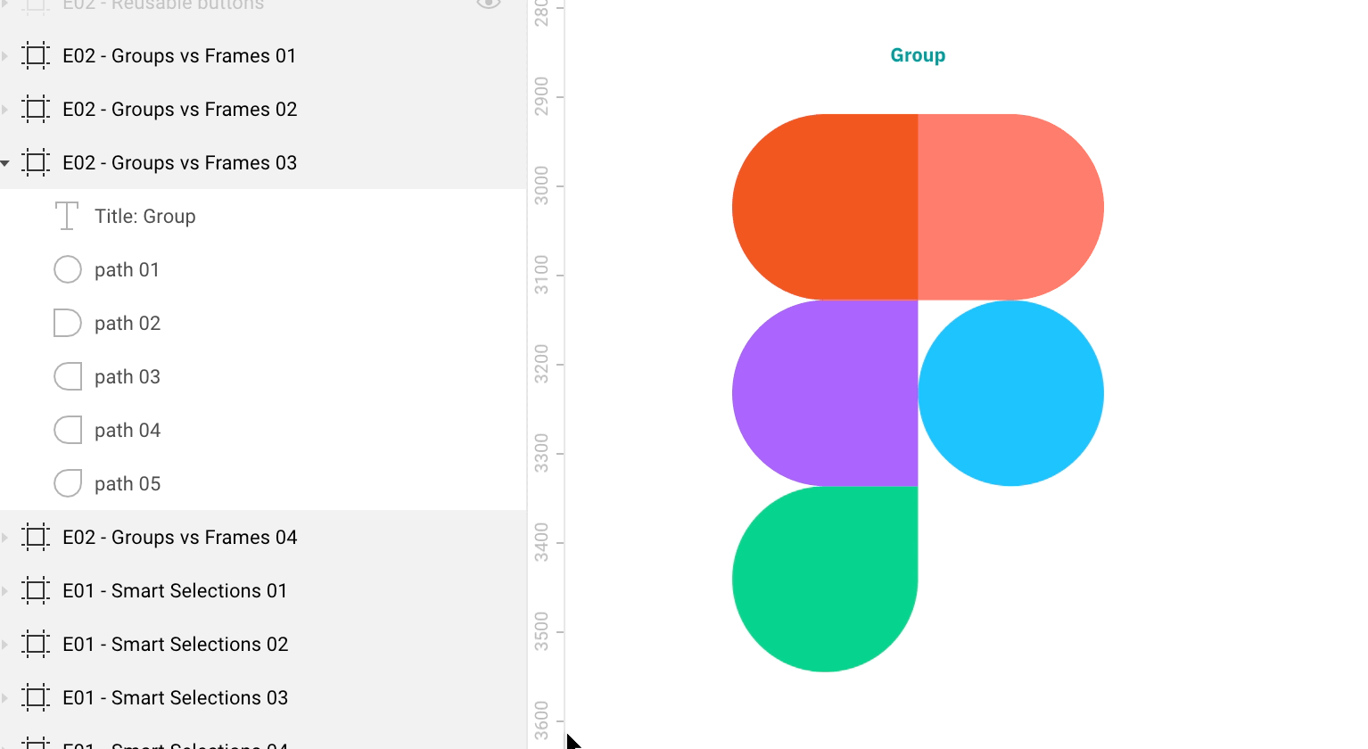
- Utilize layers panel to organize elements.
- Drag and drop to reorganize layers.
- Group layers for tidiness and easier manipulation.
- Use pages to organize distinct sections.
- Store components in the components panel.
Step 6: Advanced Techniques
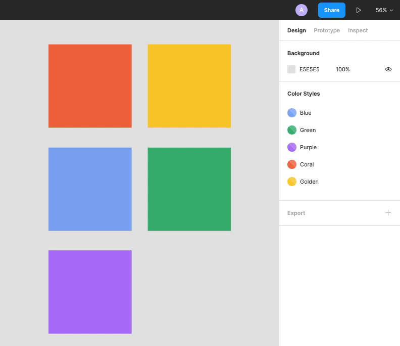
- Create styles for color, typography, grids, and effects:
- Make a shape.
- Set the fill to the desired color value.
- Select the color styles by clicking on the square icon.
- To add a category, click “+.”
- Create reusable components for consistent design.
- Select the item click or on the top-right create component button.
- The purple component icon appears in the layers panel after that.
- Nested instances can be swapped using the right-hand instance swapping menu and dragging and dropping them from the components overview or your team library.
- Utilize Auto Layout for dynamic frames.
- Add your content.
- In the right-hand side auto-layout properties menu, you can change those values.
- When you alter the content, the button will resize automatically.
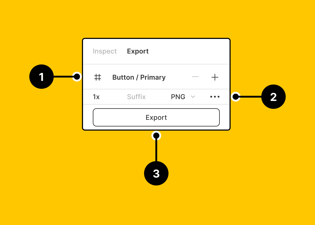
- Export assets in desired formats and sizes.
- Select an object.
- On the properties menu on the right, select export.
- Define the export process and you’re done.
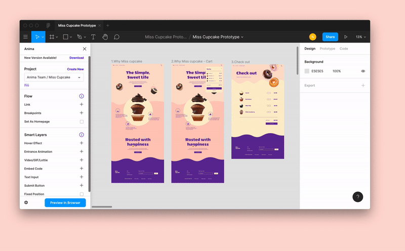
- Prototype designs for web and app interfaces.
- Select the device you’re developing for under “Prototype Settings.”
- To view your design in action, press the play button on the upper right hand.
- Use the Figma Mirror app to preview his/her work in real-time on your phone.
takeaways
Use it like your new superpower, adding to your casual design politics and prankster’s behaviour! Good luck mate!


Leave a Reply