
anh note’s for additional research on Project 3: Small Business Website
DIV for Structural Layout
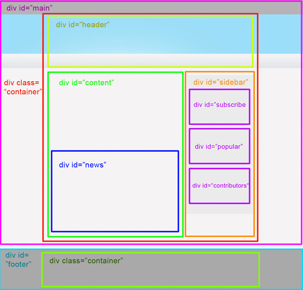
- Understanding DIV:
<div>is a fundamental HTML element used for dividing sections of a webpage.- It’s versatile and acts as a container for other HTML elements, allowing for organized structuring of content.
- Guidelines for Using DIV:
- Semantic Structure: Use
<div>elements to define semantic sections of your webpage, such as headers, footers, sidebars, and content areas. - Clear Hierarchy: Maintain a clear hierarchy by nesting
<div>elements appropriately. Each<div>should serve a distinct purpose within the webpage layout. - CSS Styling: Apply CSS styles to
<div>elements to control layout, positioning, and visual presentation.
- Semantic Structure: Use
- Example:
<div class="header">
    <h1>Welcome to My Website</h1>
</div>
<div class="content">
    <p>This is the main content of the website.</p>
</div>
<div class="footer">
    <p>Contact us at example@example.com</p>
</div>
Additional Resource: HTML div element and CSS by Sparisoma Viridi
MAP for Image Mapping

- Understanding MAP:
<map>is an HTML element used in conjunction with<area>elements to define clickable areas within an image.
- Guidelines for Using MAP:
- Image Preparation: Prepare an image with distinct regions you want to make clickable.
- Defining Areas: Use
<area>elements within<map>to define shape and coordinates for clickable regions. - Linking URLs: Assign URLs to
<area>elements to redirect users to specific pages or resources when clicked.
- Example:
<img src="example.jpg" usemap="#exampleMap" alt="Example Image">
<map name="exampleMap">
    <area shape="rect" coords="0,0,50,50" href="page1.html" alt="Area 1">
    <area shape="circle" coords="100,100,50" href="page2.html" alt="Area 2">
    <area shape="poly" coords="200,200,250,250,200,300" href="page3.html" alt="Area 3">
</map>
Additional Resource: HTML Image Map Tutorial by Portfolio Course
Flexbox for Flexible Layouts
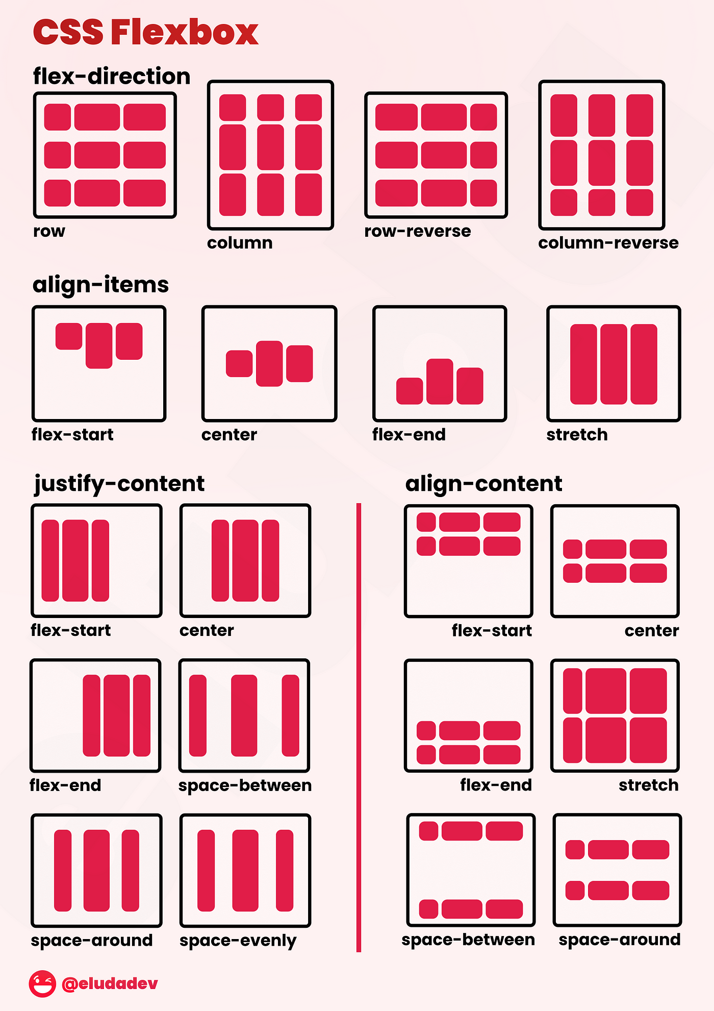
- Understanding Flexbox:
- Flexbox is a CSS layout model that provides a more efficient way to design flexible and responsive layouts in CSS.
- Guidelines for Using Flexbox:
- Container and Items: Apply
display: flex;to the container element and use properties likeflex-direction,justify-content, andalign-itemsto control the layout of child items. - Responsive Design: Utilize Flexbox to create responsive layouts that adapt to different screen sizes and orientations.
- Flexibility: Leverage properties like
flex-grow,flex-shrink, andflex-basisto control how items within the flex container grow or shrink based on available space.
- Container and Items: Apply
- Example:
flex-container {
    display: flex;
    flex-direction: row;
    justify-content: space-between;
    align-items: center;
}

.flex-item {
    flex-grow: 1;
    flex-shrink: 1;
    flex-basis: 0;
    /* Additional styling for flex items */
}
Additional Resource: Understanding Flexbox: A Comprehensive Guide by Make Computer Science Great Again
Leave a Reply