
anh note’s for additional research on Project 3: Small Business Website
- Planning and Design:
- Define Structure: Determine the layout and components of your navigation bar and footer. Consider elements such as menus, logo placement, social media icons, and contact information.
- Wireframing: Sketch the visual representation of your navigation bar and footer to establish the arrangement and functionality of each element.
2. HTML Structure:
- Semantic Markup: Use semantic HTML tags like
<nav>for the navigation bar and<footer>for the footer to enhance accessibility and SEO. - Divide Sections: Structure your navigation bar and footer into logical sections using
<ul>(unordered lists) and<li>(list items).
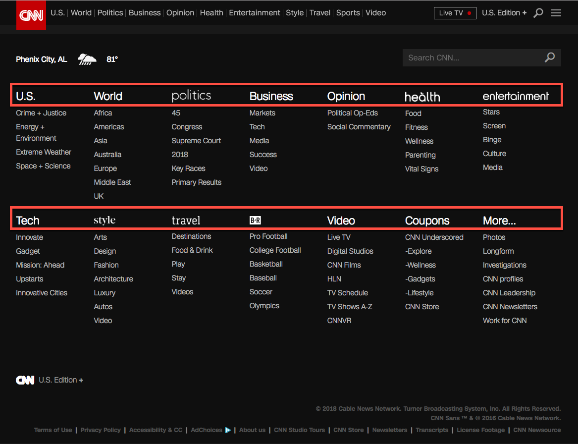
3. Navigation Bar:
- Responsive Design: Ensure your navigation bar is responsive and adapts to different screen sizes using CSS media queries.
- Dropdown Menus: Implement dropdown menus for organizing subcategories or additional pages. Use
<ul>for the dropdown container and<li>for each menu item. - Accessibility: Include keyboard navigation and ensure text alternatives for icons or images to support users with disabilities.
- Highlight Active Page: Use CSS to highlight the current page or section in the navigation bar to provide visual feedback to users.
Example:
<nav>
  <div class="container">
    <div class="logo">
      <a href="#">YourLogo</a>
    </div>
    <ul class="menu">
      <li><a href="#">Home</a></li>
      <li><a href="#">About</a></li>
      <li class="dropdown">
        <a href="#">Services</a>
        <div class="dropdown-content">
          <a href="#">Service 1</a>
          <a href="#">Service 2</a>
          <a href="#">Service 3</a>
        </div>
      </li>
      <!-- Add more menu items as needed -->
    </ul>
  </div>
</nav>
4. Footer:
- Copyright Information: Include copyright information and company details in the footer section.
- Contact Information: Provide contact details such as address, phone number, and email for users to reach out.
- Social Media Links: Add icons or links to your social media profiles for users to connect with your brand.
- Site Map: Optionally, include a site map or additional navigation links for easy access to various sections of the website.
Example
/* Navigation Bar Styles */
nav {
  background-color: #333;
  color: #fff;
  padding: 10px 0;
}
nav .container {
  display: flex;
  justify-content: space-between;
  align-items: center;
}
nav .menu {
  list-style: none;
  display: flex;
}
nav .menu li {
  margin: 0 10px;
}
nav .menu li a {
  color: #fff;
  text-decoration: none;
}
nav .dropdown-content {
  display: none;
  position: absolute;
  background-color: #333;
  padding: 10px;
}
nav .dropdown:hover .dropdown-content {
  display: block;
}

/* Footer Styles */
footer {
  background-color: #333;
  color: #fff;
  padding: 20px 0;
  text-align: center;
}
footer .container {
  display: flex;
  justify-content: space-between;
  align-items: center;
}
footer .footer-logo a {
  color: #fff;
  text-decoration: none;
}
footer .footer-social a {
  color: #fff;
  text-decoration: none;
  margin: 0 10px;
}
5. CSS Styling:
- Consistent Styling: Apply consistent styling across the navigation bar and footer to maintain visual coherence.
- Color and Typography: Choose appropriate colors and fonts that align with your website’s design theme and branding.
- Spacing and Alignment: Ensure proper spacing and alignment of elements for a clean and organized appearance.
- Hover Effects: Add hover effects for menu items and social media icons to provide visual feedback to users.
Example
/* Navigation Bar Styles */
nav {
  background-color: #333;
  color: #fff;
  padding: 10px 0;
}
nav .container {
  display: flex;
  justify-content: space-between;
  align-items: center;
}
nav .menu {
  list-style: none;
  display: flex;
}
nav .menu li {
  margin: 0 10px;
}
nav .menu li a {
  color: #fff;
  text-decoration: none;
}
nav .dropdown-content {
  display: none;
  position: absolute;
  background-color: #333;
  padding: 10px;
}
nav .dropdown:hover .dropdown-content {
  display: block;
}

/* Footer Styles */
footer {
  background-color: #333;
  color: #fff;
  padding: 20px 0;
  text-align: center;
}
footer .container {
  display: flex;
  justify-content: space-between;
  align-items: center;
}
footer .footer-logo a {
  color: #fff;
  text-decoration: none;
}
footer .footer-social a {
  color: #fff;
  text-decoration: none;
  margin: 0 10px;
}
Testing and Optimization:
- Cross-Browser Compatibility: Test your navigation bar and footer across different web browsers to ensure consistent rendering.
- Mobile-Friendliness: Verify that your navigation bar and footer are mobile-friendly and provide a seamless experience on smaller devices.
- Performance Optimization: Optimize code and assets to improve page load times and overall website performance.
Leave a Reply