I’m a graphic designer, but I love journalism, especially its adaptation to the internet landscape past few decades. I know newspaper target audience is mostly “serious” business and adults. But anyone needs a good source of information. Kids don’t read these day, so:
How can you provide information while still make it interesting to consume for a 9 seconds attention span?


newspaper website design
anh’s note from reading Newspaper Website Design: Trends And Examples by Steven Snell


A newspaper website, according to Wikipedia, serves as the digital counterpart to traditional newspapers, providing news content, articles, and features in a digital format accessible via the internet. Yet, keep in mind that digital is more of the main view now.
Content Display Challenges:
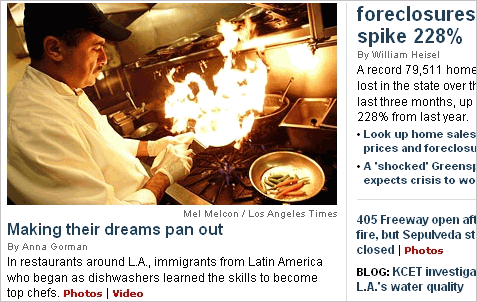
- News websites must effectively manage and display a large volume of content on the homepage, leading to layout, usability, and navigational hurdles for designers.
- These challenges are applicable to various types of websites, including those with blog themes.
Monetization Considerations:
- Integrating advertisements into the design is crucial for monetization.
- Some websites struggle with intrusive or excessive ads, while others balance ads effectively alongside content.
Variety in Newspaper Websites:
- The term “newspaper website” encompasses online periodicals, major newspapers’ online versions, standard news websites, and hybrids of news and blogs.
the design
Color Schemes:
- Dark text on white: Ensures readability with the high volume of content.
- Blue and red accents: Commonly used for headlines, links, and accents.
- Additional colors: Introduced in navigation elements for visual interest.
Header and Sidebar Banners:
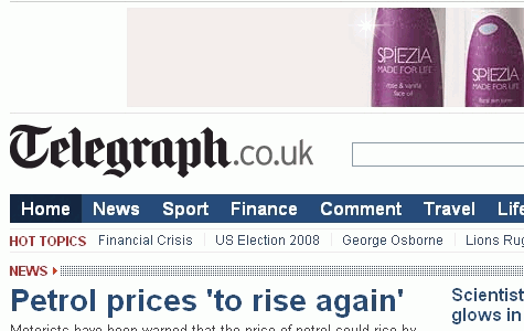
- Crucial revenue source: Banner ads, particularly in headers, are essential for monetization.
- Varied ad placements: Some exclude banners on the home page, while others feature them prominently.
- Banner dimensions: Sidebar banners often larger, such as 300 by 250 pixels.
Top Navigation:
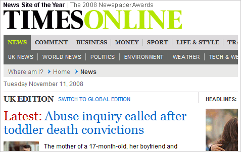
- Primary navigation placement: Typically located below the header and above the content.
- Navigation styles: Vary from traditional dropdown menus to tabbed interfaces.
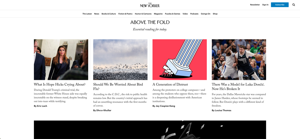
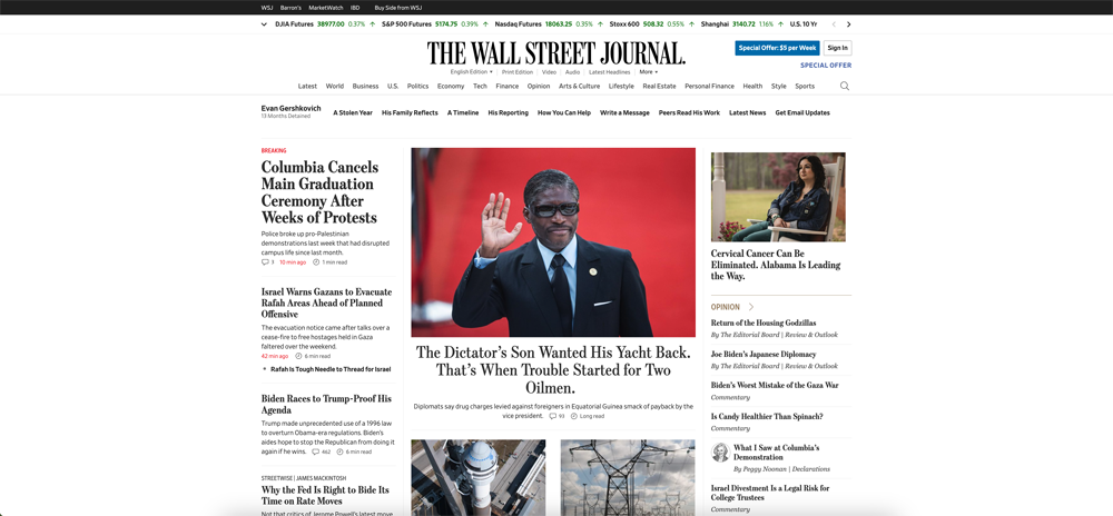
- Exceptions: Some sites, like The New York Times, utilize left sidebars for navigation.
Tabbed Content Areas:
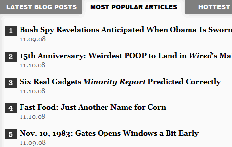
- Enhanced user control: Allows access to popular, recent, or commented articles.
- Space-saving design: Efficiently organizes content in sidebars or main areas.
- Examples: Wired and The Guardian utilize tabbed interfaces effectively.
Grid-Based Layouts:
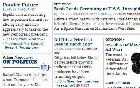
- Efficient organization: Grid layouts effectively manage large content volumes.
- Visually appealing: Provides a structured and aesthetically pleasing design.
- Examples: The New York Times and The Guardian employ grid-based layouts.
Social Media Integration:

- Subtle integration: Social media widgets are discreetly incorporated into the design.
- Prominent sharing buttons: Ensure social sharing without dominating the layout.
- Exceptions: The Huffington Post features dedicated sections for social media content.
Really Simple Syndication (RSS) Feeds:
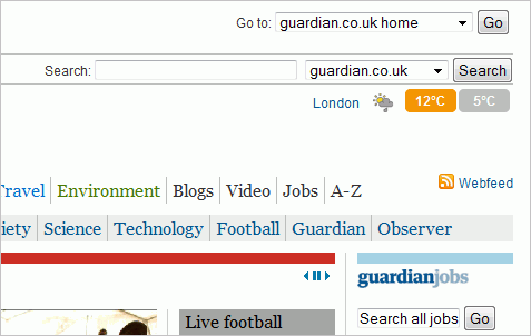
- Less prominent: RSS icons or links are available but not emphasized in the design.
- Availability: Most news websites offer feeds but do not prioritize them in the layout.
- Example: The Guardian includes a feed link in its header.
Comments:
- Reduced emphasis: Comments sections are less visible in the design hierarchy.
- Importance: Reader comments are essential but not prominently featured.
- Exception: ABC News prominently displays comment counts on home page excerpts.
Leave a Reply