
anh’s note from reading The History of Website Design: 30 Years of Building the Web by Ryan Shelley and The history of web design by Canva:

For any new, interesting design topics I encounter, I always find doing a brief history deep dive helpful. To me, history is quite similar to physics, which is easier to remember random technical information by seeing how and why it appear through timeline, social contexts, and connects by stories.
When you study its developement throughout history, you learn hella of experiences, test your fearless youngster ideas, and be able to apply your current techno-savviness to its foundation effectively.
Anonymous Gangster
Although website has only existed for 30 years, yet there are 1.13 billion websites on the internet in 2023, with 200 million are actively updated and visited.
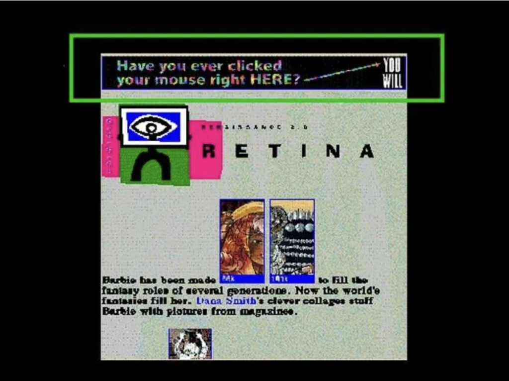
Late 80s: The Dark Ages of Design
The concept of the “world wide web” was first described in 1946, in a short story by Murray Leinster, yet its offcial invention is credited to physicist Tim Berner-Lee in 1989. While creating a database of software for a client, he used hypertext1 to create an index of pages on the system. The “world wide web” (www) is a hypertext-based system that allows users to share information over the internet.
In the late 80s, designers would work on black screens with pixels. Designs were made up of symbols and tabulation (the TAB key). This dark ages is characterized by pixelated background, icons and blocky text.
1991: The First Web Page…
On August 6, Berners-Lee (the physic guy) launched the world’s first web page: CERN. Hosted on a NeXT computer at the European Organization for Nuclear Research, this was a simple page containing information about the World Wide Web. The very first website was 100% text-based, with only splash of color from the blue hypertext.
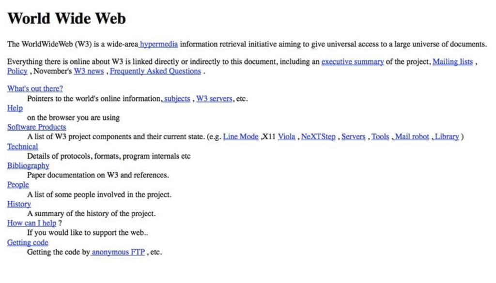
This breakthrough started a new career segment called “web designers”, who worked with HTML tables to organize content horizontally and vertically.
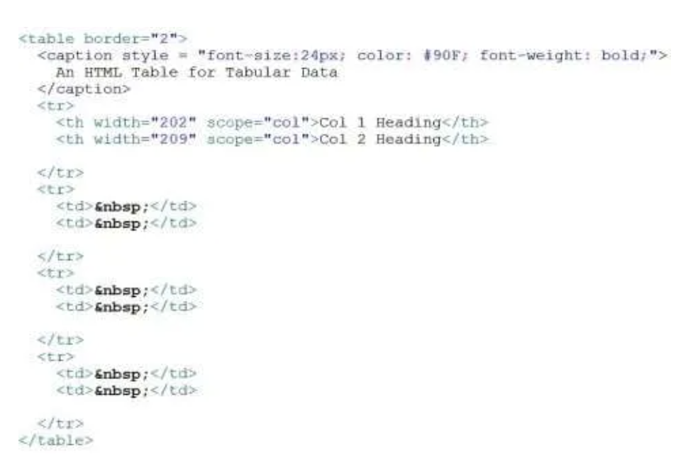
…and HTML
The only real way to add structure was through the power of the <table>. The purpose of tables was to create a structure for numbers, but designers used them to create site structure, like aligning elements vertically. Tables paved the way for the future grids.
1992: The first photo on the internet
In 1992, when Berners-Lee rolled out an update of his browser that could support photos, his team tested it out of this image taken of the band backstage by an IT developer. After this, pictures quickly become an essential facet of website in the 90s.

In my hard-earned experience, it’s essential (working faster) to prepare all your image size optimized before uploading to your website. Here are some pointers:
- File & Image Size: no more than 200 KB (maximum width of 800 pixels, except for header images being 1024 pixels wide) and full-screen background images should be between 1500–2500 pixels wide.
- Format: JPG, PNG, SVG, BMP, TIFF, and GIF. WebP is a modern format that reduces file size without sacrificing quality.
- Aspect Ratio: 1:1, 4:3, and 16:9, but 4:5 (portrait) is better for mobile. When creating images, size them to the same aspect ratio as the area they’ll be placed in.
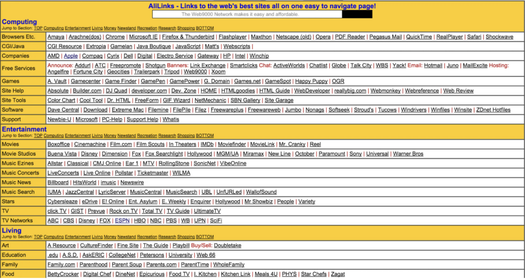
1993: The Launch of Search…
ALIWEB! ALIWEB (Archie Like Indexing for the WEB) is the first web search engine, providing users with helpful links to the web’s best content (bro, 1st design move checked). They wanted users to be drawn into the site’s links, by using a colored background representing the more important elements of the page.
…and the Landing Page
MTV launched its website, with a landing page (the image you saw when you landed on their site), stepping from of text-heavy layout. From my perspective, the reason is that we interprete the content faster through images or illustration than texts.

By the end of 1993, there were 623 websites.
1994: Add Advertising to the Design…
While many sites became overcrowded with ads during the 90s, Hotwire, now known as Wired, did a nice job of adding the world’s first banner ad into their site’s header. The first banner ad was purchased by technology company AT&T on HotWired.com in 1994. This ad was clicked on by 44% of people who saw it and it created an undeniable buzz amongst advertisers and consumers alike. At the same time, this page had very little text, but more design elements to engage the users.

By mid-1994 there were 2738 websites, according to Gray’s statistics, and by the end of the year, more than 10,000.
…web hosting service Geocities
This allowed users to create free homepages, hosted in six different ‘neighborhoods.’ This marked the first time everyday people could easily create websites of their own: bright, patterned backgrounds, clip art, and experimental text formatting.
1995: Javascript
The world’s most important web programming language was invented—Javascript. Originally called Mocha and later, LiveScript, Javascript was invented to allow Netscape developers to websites to automate behaviours in their web design. It translates a static page into a interactive page for users, without them having to wait for a new page to load every time they make a request. The new script technology gave away to interactive elements: drop-down menus, pop-up windows, embedded forms, etc.
1996: The rise of Flash
Internet users more than doubled in the year 1996 to 36 million users worldwide. In 1996, we saw the number of websites grow from 25,300 to 257,601, taking the average user per website from 1980 to 301.
FutureSplash, later known as Adobe Flash, gave web designers the freedom to create more dynamic websites by integrating animation, video, and audio. These multimedia elements were packed into a file, then sent to a browser to be displayed. However users had to have the correct flash technology installed to view these animations.

Its downfall came from the lack of being “search friendly” and its heavy consumption of processing power. However, they were a predecessor to elements like animation, video, and micro-interactions, including memes.
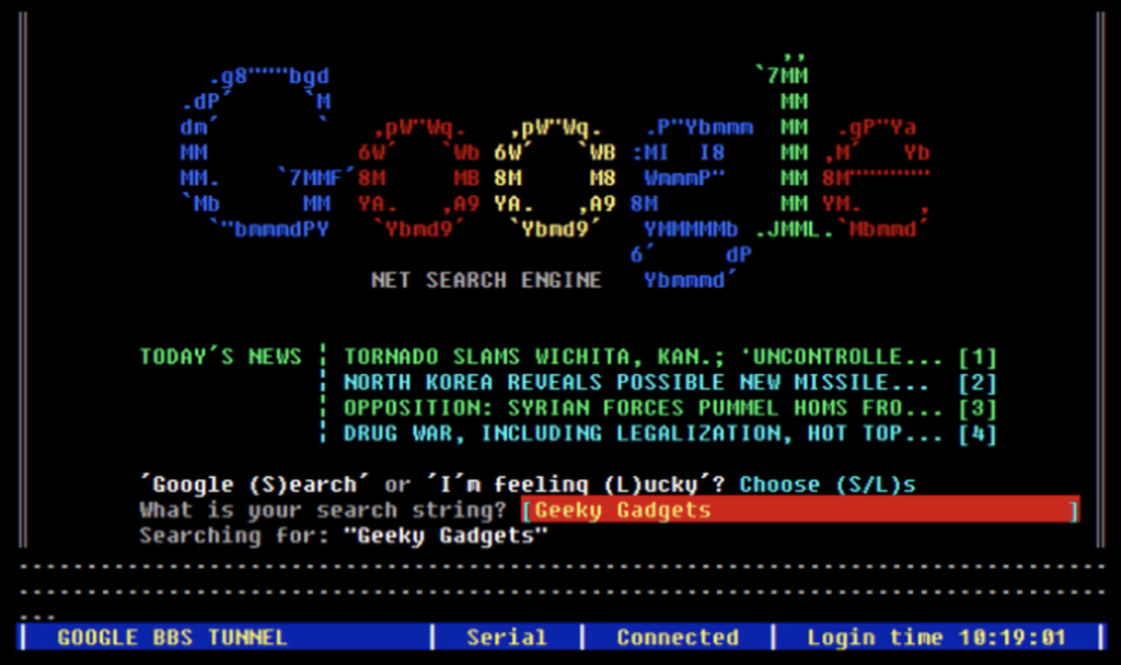
1998: Google…
Google Beta, a search enginge, went live on September 4. Instead of opting for a link-filled page, Google chose the minimalistic route.

…and the invention of CSS
Otherwise known as Cascading Style Sheets, CSS programming software was created by Hakon Wium Lie and Bert Bos in December 1996. This allowed the content (HTML) to be separated from the visual elements (the layouts, colors, and font) for the very first time. This gave designers far more flexibility and control of the appearance of a website than ever before.
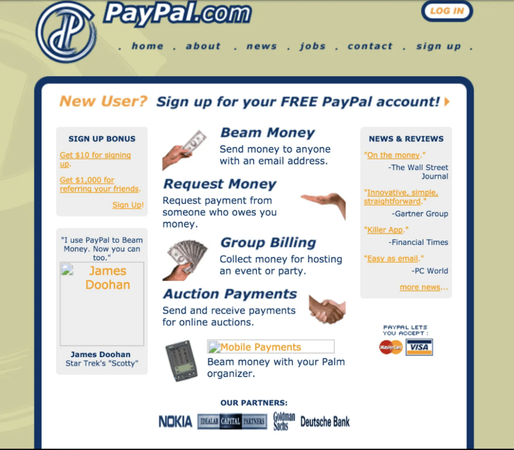
2000: The Online Economy
Paypal, the world’s leading online payment company, started in 1999, but it was in the year 2000 that PayPal really took off. As more and more businesses were going online, having a great-looking website was starting to become a need.
2003: Let’s Blog About It
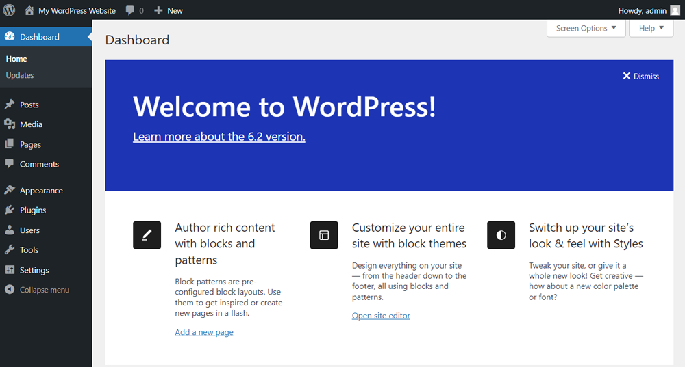
Up until the year 2000, website design was much more of a technical field handled by company IT departments. It all changed when WordPress, which is now the world’s leading content management system (CMS), was launched in 2003. There were 2,000 WordPress2 blogs as of May 2003. As of January 2015, more than 23.3% of the top 10 million websites now use WordPress (I love WordPress, so intuitive).
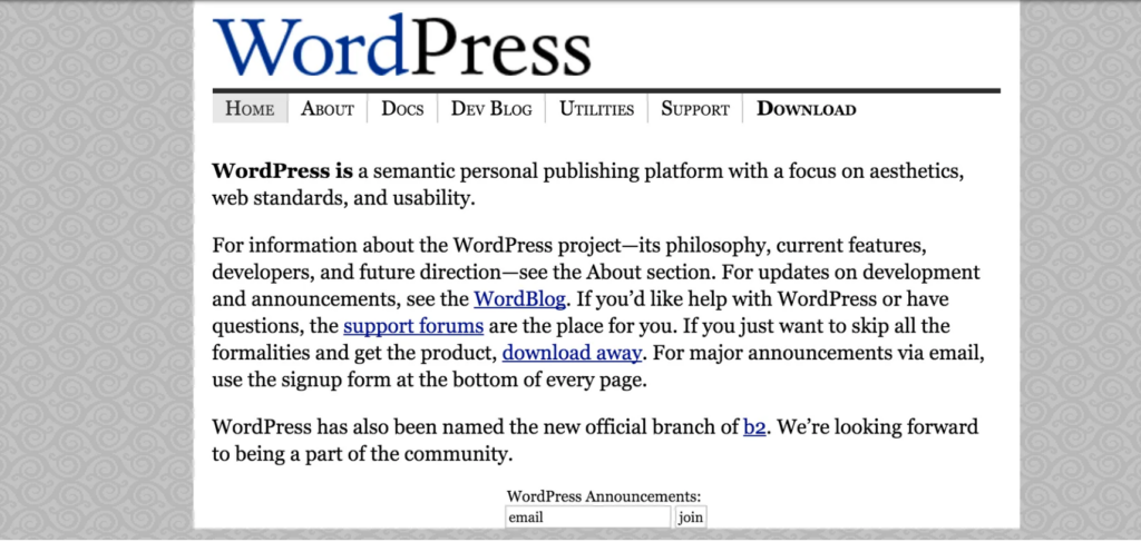

Today, WordPress is the world’s leading Content Management System, offering both a free blogging platform and open-source software for designers.
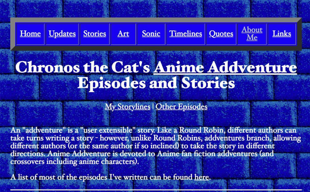
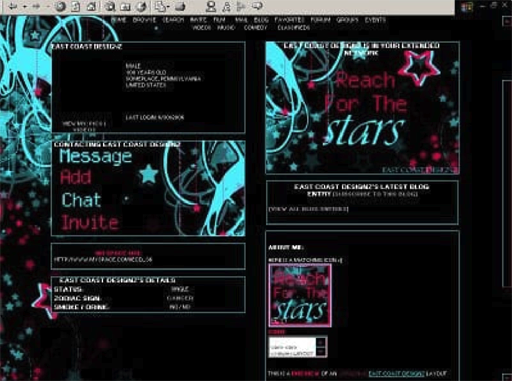
2004: The rise of MySpace
MySpace became a place for users to create their own profiles and connect with a wide range of online users. They allowed their users access to HTML editors to customize their “wall” or layout. Many web designers got their early exposure to HTML using the MySpace platform: a ‘more-is-more’ aesthetic, filled with glittery graphics, image-heavy layouts, and blocks of texts.

2007: The Facebook Goes Public…
Facebook was originally launched in 2004 alongside MySpace, by only for college students with their school (.edu) email. In 2006, Facebook went public and altogether changed social media and how the public used the Internet. Facebook didn’t allow users to customize their page code like MySpace. Instead, it chose a simple, consistent look throughout the network, its design around its brand. Everything about their network said something about Facebook. Their users connected with their brand and quickly became evangelists of the site.

Today Facebook is the most visited site in the US and has over 1 Billion users worldwide.
…and The Mobile Era
With the launch of the first iPhone in 2007, making websites accessible on mobile phones became a priority for the first time. 960-grid systems and 12-column division rose in popularity in design to address the demand for browsing on mobile. Bootstrap3 and Foundation4 became the base for the new mobile web world.
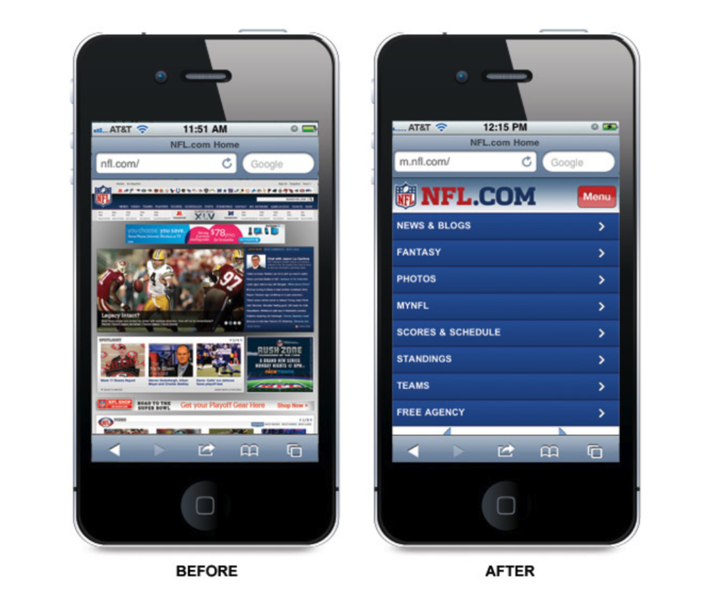
The mobile era gave way to grid-based layouts and flat design, when traces of depth and 3D effects have been removed to make content easier to read on a smaller screen.
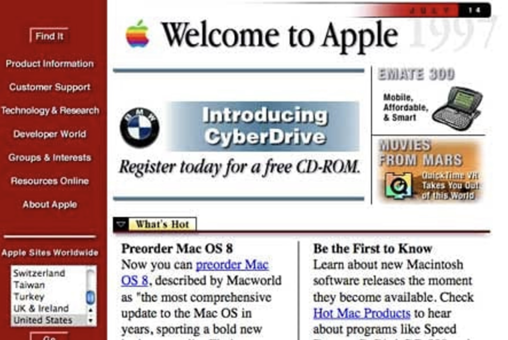
While users had been surfing the web on very basic browsers prior to the invention of the smartphone, most found it to be frustrating and unnecessary. While Apple didn’t invent the SmartPhone, they did make it mainstream. Apple has always been known for its products and designs. In 2007, they showcased their brand online with this smart and simple design.

2009: Images Get Social
Flickr was named one of Time’s 50 best websites of 2009. Created by Yahoo, Flickr gave people a place to store and share their photos online. Flickr was the first site to use collaborative tagging. The idea is that if everyone is allowed to tag everyone else’s uploaded photos, then a rough-and-ready categorization will naturally emerge from the wisdom of the crowd.

2010: The Responsive Design
Respond to the growing popularity of smartphone browsing, responsive design was invented. This technology allows designers and developers to create build websites that automatically adjust and scale to any size, regardless of what device you’re browsing on.

Now responsive design is a necessity. In order to appear credible and professional and give users a pleasant browsing experience, designers must optimize their website for all devices.
Ryan Shelley
2014: The rise of Inbound
With a growing online economy, businesses were looking for more ways to interact and connect with prospects. By offering advice and engaging prospects with their website, marketers could attract potential customers to their websitem, rather than pushing ads at them. This called Inbound. Hubspot’s success in using inbound marketing has helped thousands of companies worldwide.

2015: Growth-Driven Design
Over the last ten years, HTML, responsive design and CSS have continued to reign supreme. However, there is no longer a one-size-fits-all definition of what a ‘good’ website design looks like.
As of December 2015, there were more than 935,000,000 websites published as a part of the world wide web. Google began to make consistent algorithm adjustments to combat black hat5 linking tactics. By this time, even traditional brick-and-mortar stores understood the need for a strong digital presence. More than that, many websites were becoming a company’s “best salesperson”.

Growth-Driven Design takes a systematic approach to Search Engine Optimization (SEO) to help ensure that companies are spending time attracting the right visitors and closing better leads, which results in a better Return On Investment (ROI) and faster revenue growth. The best businesses understand that their website is never “finished.” Instead, they work with marketers to ensure that their website adapts and grows with their users.
2016: Social Media & White Hat Backlinks
Social media platforms such as Facebook, Instagram, Twitter, LinkedIn, YouTube, and Pinterest, all functioned as search engines much like Google and Yahoo. This increased the demand for content and marketers were stretched further every month.

Relevant internal and external backlinks are a vital part of helping Google understand your website’s context and authority. The need for white hat backlinks6 also increases the pace at which companies begin pushing content on social. The metrics to accurately measure the ROI of social selling are not fully understood, however, sales professionals believe in the power of social selling.
2019: Data-backed OmniChannel Marketing
Today’s marketers understand that a company’s website is often the first opportunity they will have to connect with a potential customer: complementary colors, an eye-catching logo, and pages that present the mission of the company. Web design must also incorporate clear navigation, relevant content, and images that relate to the products or services.
Load time7 is an essential part of the overall design. With millions of websites to browse, a slow site is not worth waiting for these days.

Each page must incorporate SEO optimization on all images as well as meta descriptions and title tags. As Google continues to tweak their algorithm for semantic search marketers who stick to SEO best practices and track their progress using Google Analytics8, they will be able to make small adjustments based on insights about how their website ranks in search, organic traffic, referring sites, and the most popular pages on their website.
A great design may look nice, but it will not help Google find you.
Ryan Shelley

2020: Website Builders
A very recent impact on the history of website design was the 2020 pandemic. During the pandemic, there was a significant surge in global searches for the term “build a website”: improve and update their business existing website, build a new one in order to retain customers and attract new ones as much of the globe shifted online.
Website builders are the perfect solution for businesses to create a digital front door to showcase their services and sell products. As a designer, I also use the Adobe Creative Suite to support website building process. Aside from the website builders below, there are also SquareSpace, Shopify, and Framer.


WordPress
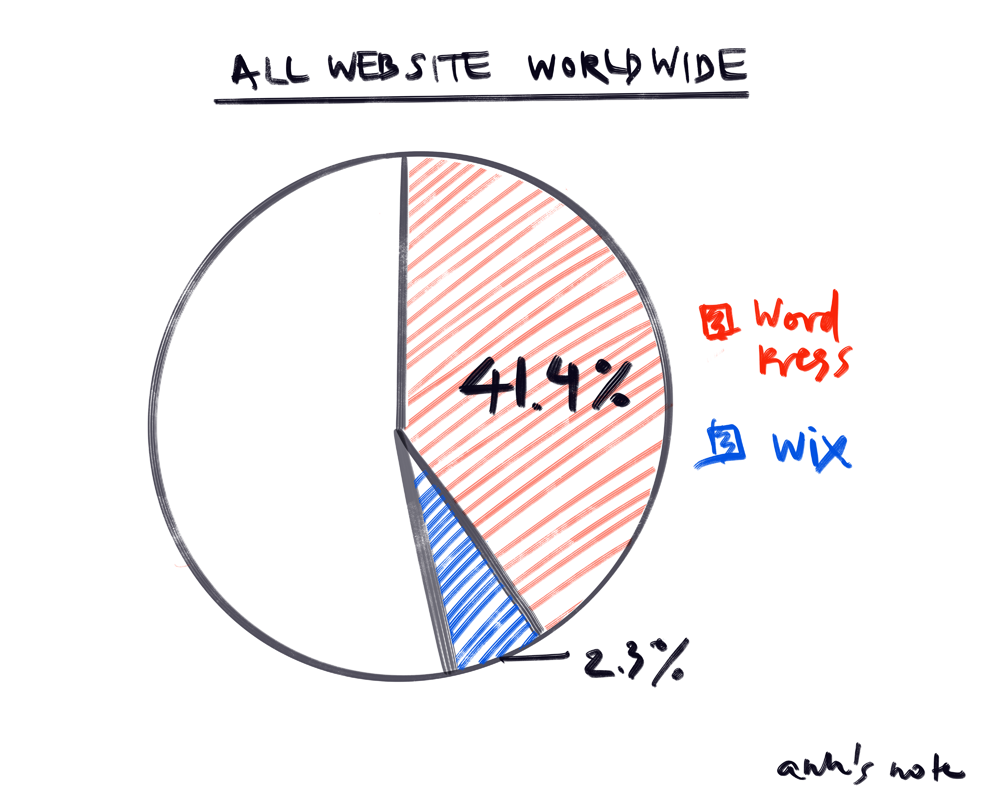
WordPress is a content management system (CMS) and remains a dominant player with 60.8% of the CMS market. When all of the WordPress SEO features are utilized, your site is a big step closer to the top of Google’s SERPs.
- Advantages: open-source, self-hosted, and free to build in, jam-packed with SEO-friendly themes, plugins, and tools.
- Costs: a domain name, hosting plan, and maybe plugin upgrades to pro versions.
- Downside: the need manage and maintain the site by yourself or hiring someone.
Wix
Wix is a fully hosted cloud-based website builder with a drag-and-drop interface that offers monthly payment plans.
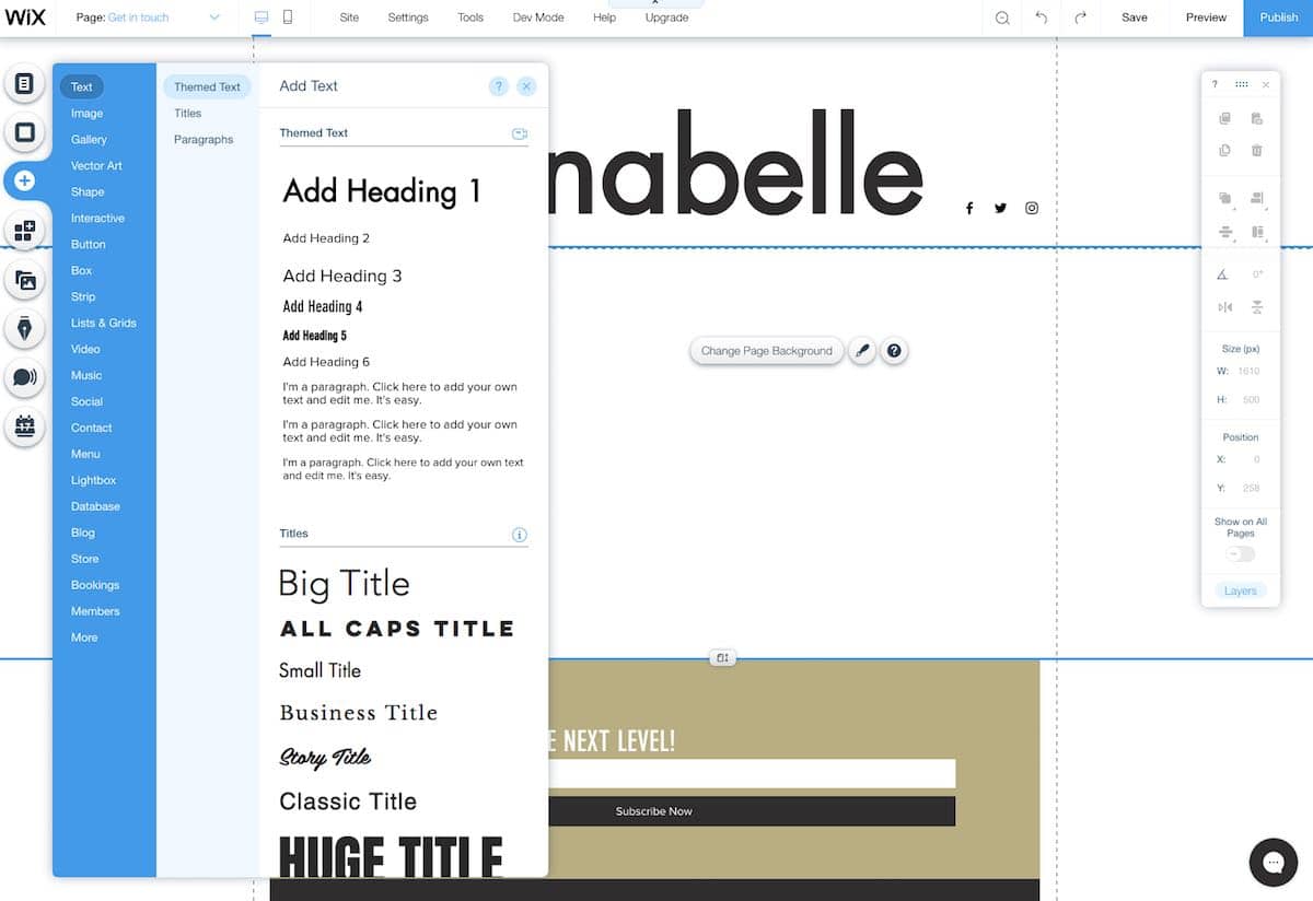
- Downside: poor SEO options, from a terrible URL structure to not being able to add alt attributes, to name a few issues (2019: released a new suite of SEO tools)
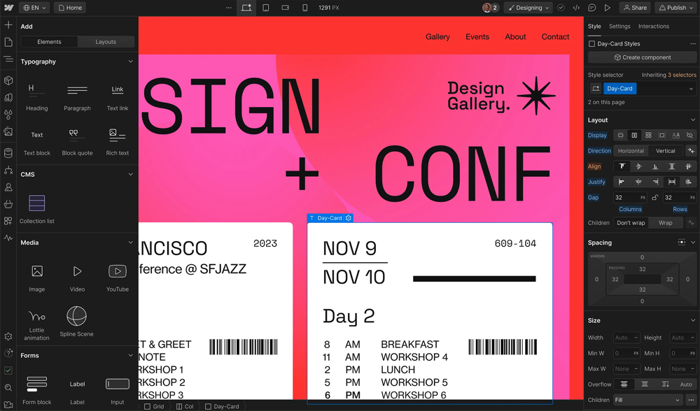
Webflow
Webflow is a website builder and hosting company that more than doubled its market share in 2020 and continues to grow in popularity.
- Advantage: over 100 templates, marketing tools, e-commerce, and more all under one roof, plus versatile plans from free to Pro.
- Downside: free vs. paying monthly fees and less control over your website.
2023 and beyond: The future of web design
Today, browsing a website is a multi-sensory experience, thanks to the growing popularity of full-screen video backgrounds, animation, and interactive navigation. As an example, the National Student Show and Conference 18 website incorporated a wide range of interactive and dynamic features: physics simulation, scroll-activated animations, mobile gyro sensing, and smooth scrolling.

With the release of ChatGPT, Apple Vision Pro, Sora AI, Midjourney, and Adobe Generative Fill, it’s safe to say that virtual reality (VR), AI (artificial intelligence) and augmented reality (AR) will be at the forefront on the future of website design.
that’s all for now
Thank you for reading until the end! I might have to remove the phrase “brief” off my headline, but I hope it was enjoyable to read. I had lots of fun time-traveling through history.
Anyways, bro I told you website is going to be most rewarding thing to design. Now we know its rizz was from its user-centered and immersive base. My takeaways for you is to just have fun with it, push when you can to learn the new techniques enhancing the user experience, and definitely pull a friend or two, or ask a professionals for help on your project. As I mentioned in my last post, designing website requires a well-rounded knowledge, prototyping, and user-testing. Start early, good luck, and, as always, have good memes in your pocket!
- Hypertext is text displayed on a computer display or other electronic devices with references to other text that the reader can immediately access. It’s text display of a link, and activated when you hover your click to it. ↩︎
- WordPress is free and CMS based on PHP and MySQL. Features include a plugin architecture and a template system.Within two years, WordPress had introduced plug-ins for further customization and themes that would allow users to change the appearance of their site without altering the content. ↩︎
- Bootstrap, initially released by Twitter in 2011, is a free and open-source CSS framework. It’s designed to help developers build responsive, mobile-first websites quickly and effectively: a set of pre-designed components (navigation bars, buttons, forms, cards) and more, that are styled out-of-the-box and easy to implement. ↩︎
- Foundation, on the other hand, is a product of ZURB in CSS frameworks. Foundation stands out with its flexibility and customizability, by providing a barebone structure, allowing developers to style their components more freely. ↩︎
- Black hat SEO is a practice against search engine guidelines, used to get a site ranking higher in search results. Black hat techniques include keyword stuffing, cloaking, and using private link networks. ↩︎
- SEO backlinks are a link from another website to your website. High-quality backlinks can increase your ranking on search engines and improve visibility in search, translating to more traffic coming to your website. ↩︎
- Tbh I looked it up. This is beyond the scope of the post. Ask a friend, break a leg, u be fine. ↩︎
- Google Analytics gives you the tools, free of charge, to understand the customer journey and improve marketing ROI. ↩︎
Leave a Reply